Waldner Farms
Rebrand & Food Packaging
Growing a New Family Produce Destination
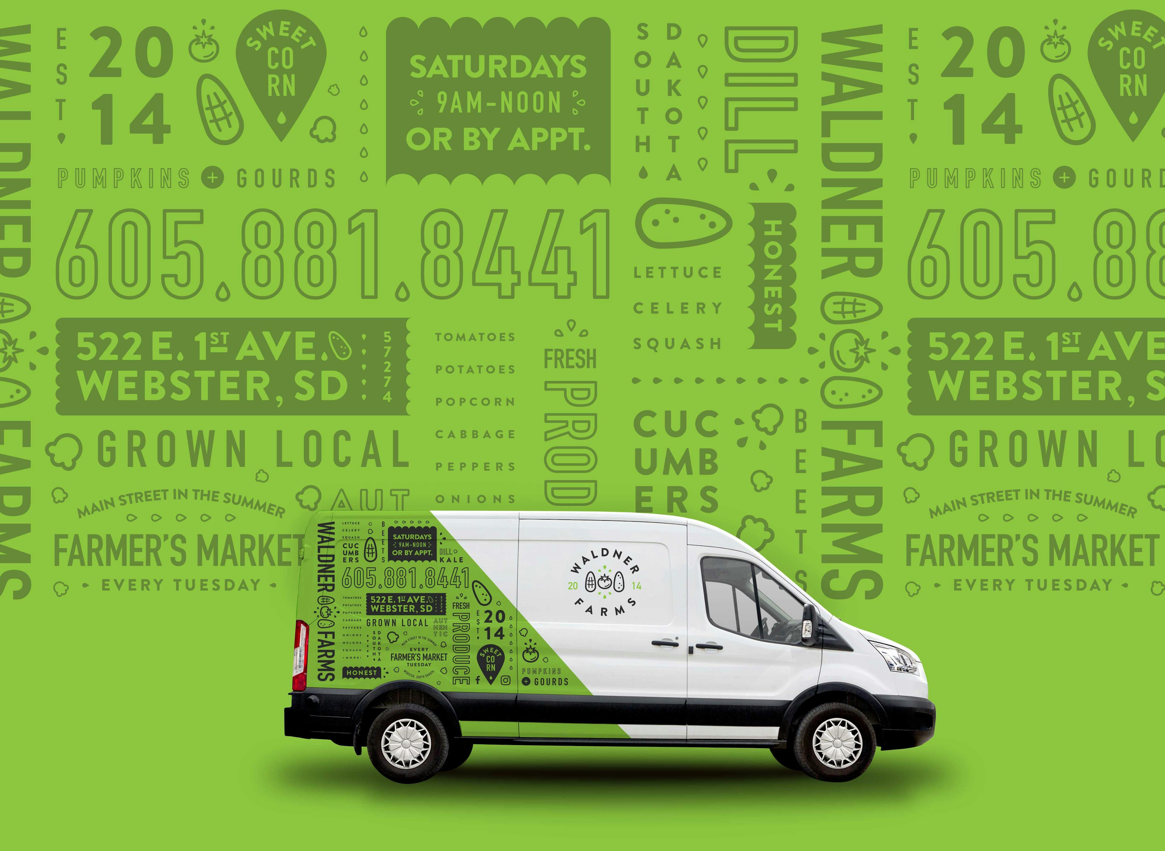
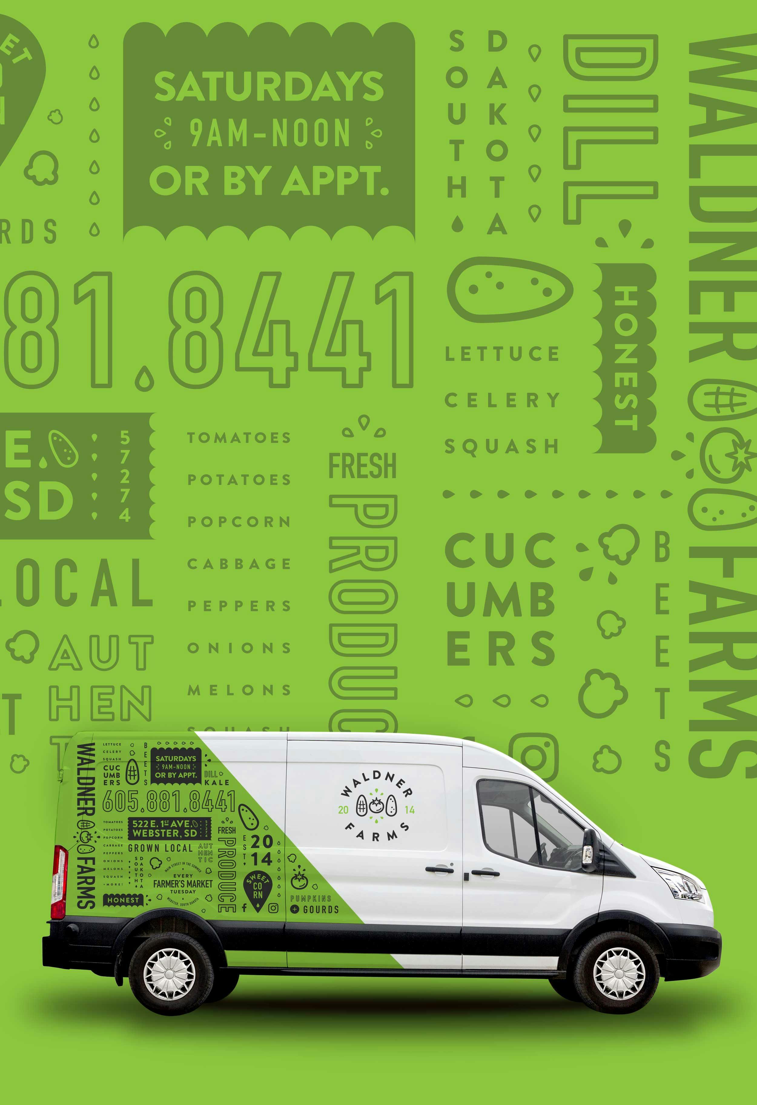
With a growing business and a new plot of land, the Waldner family wanted to modernize their old brand and introduce new, locally grown products. Through the use of intentional colors and bold typography, we set out to create a unique, fresh produce experience in person and online.


A Successful Brand Sticks to its Roots
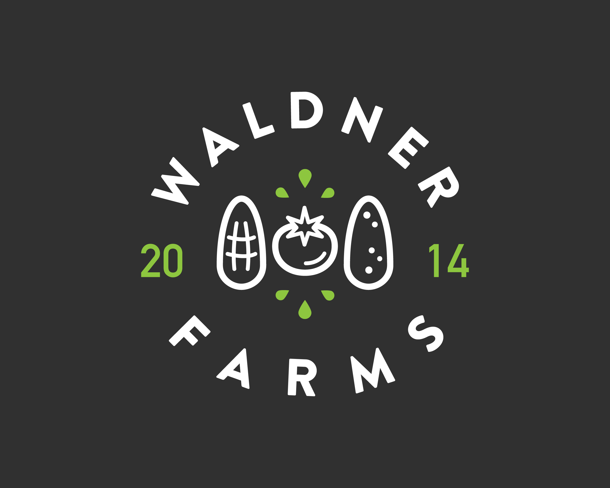
By incorporating Waldner Farm's 3 main vegetables in a plump and playful way, we delivered a family of logo variations to fit each scenario:
- A circle badge for most instances.
- A horizontal logo for wide applications.
- A stacked logo for narrow spaces.
- An icon for areas where text would be too small to read.
+ A few different color variations to spice up the brand's overall flavor.
On Point Packaging
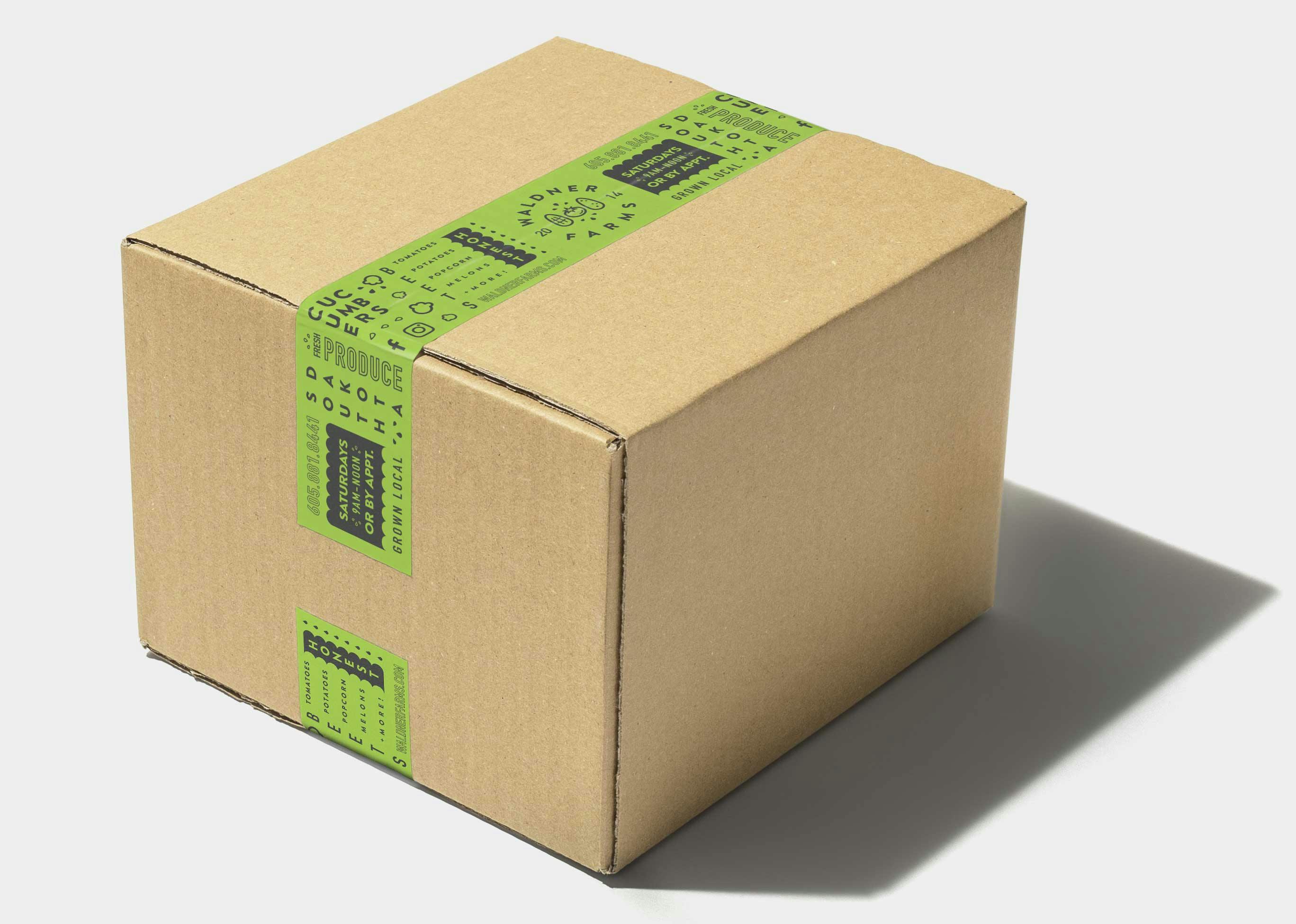
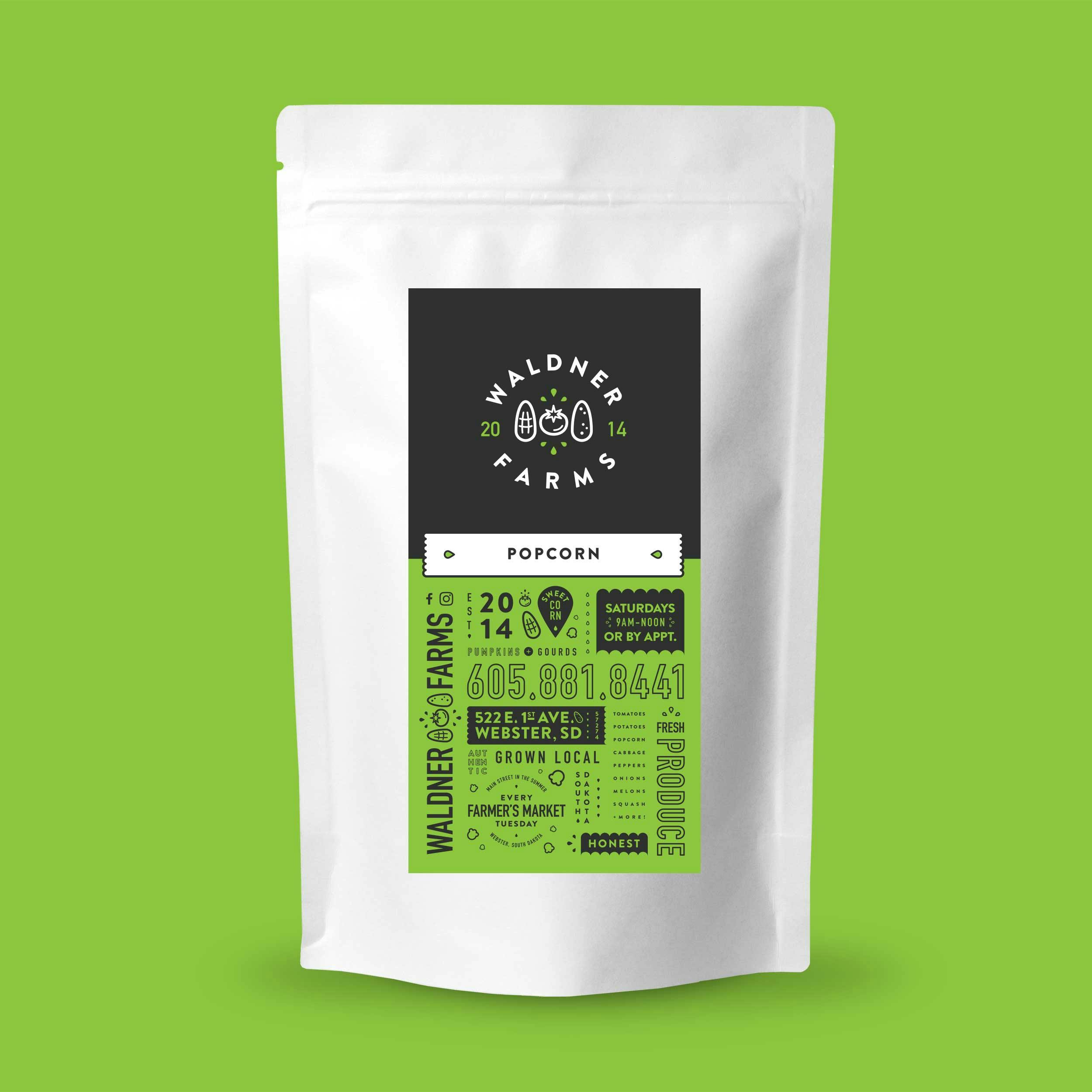
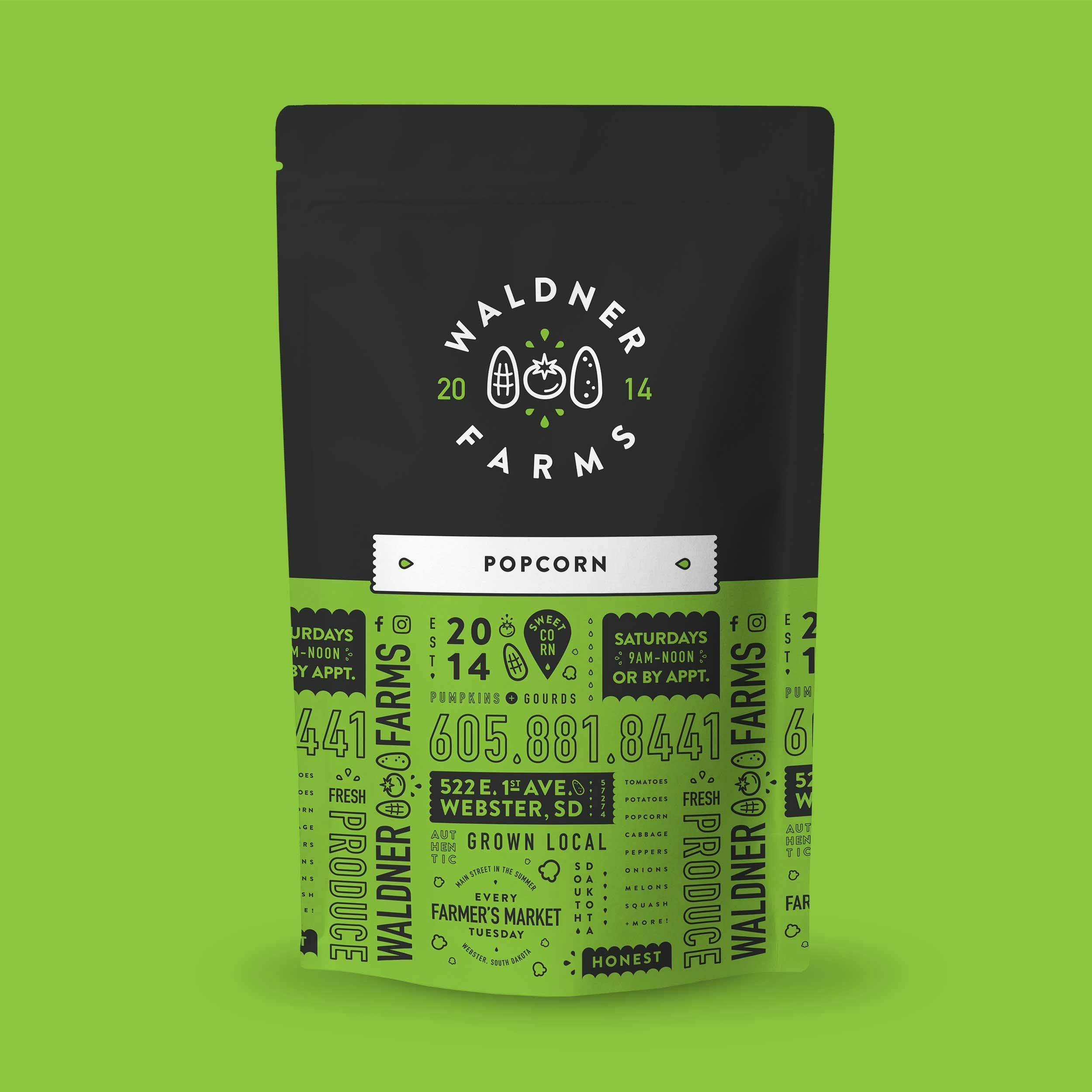
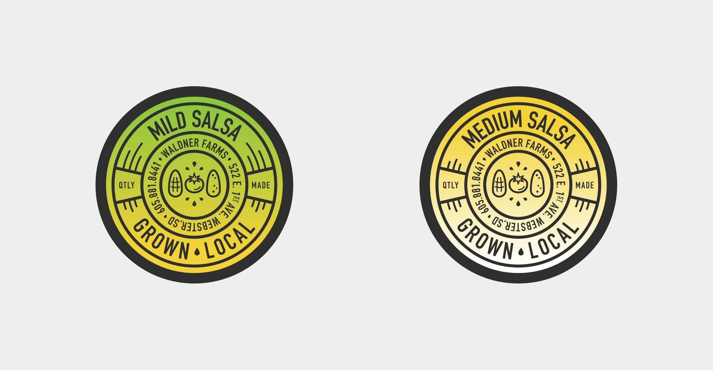
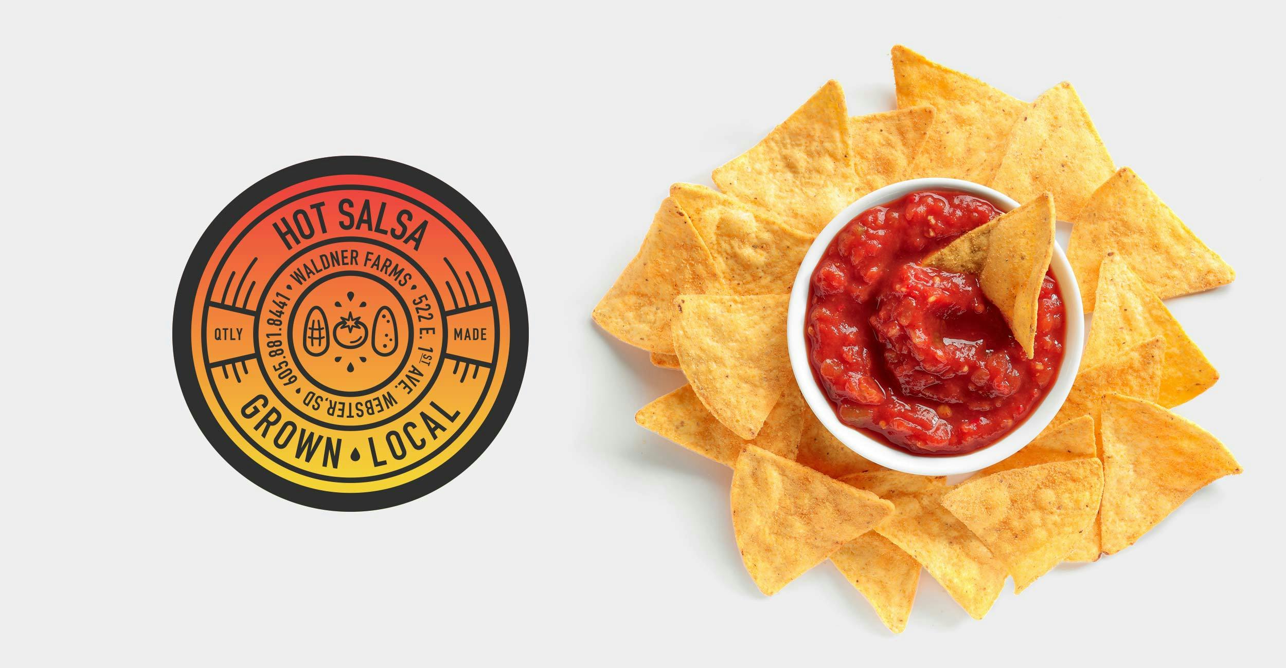
With an online, mobile and physical location, we created a memorable packaging experience through color, consistency and quality. We explored popcorn packaging with an economical sticker and an elevated, full color version. We then tied everything together through Waldner Farms canned goods and salsa lid stickers.



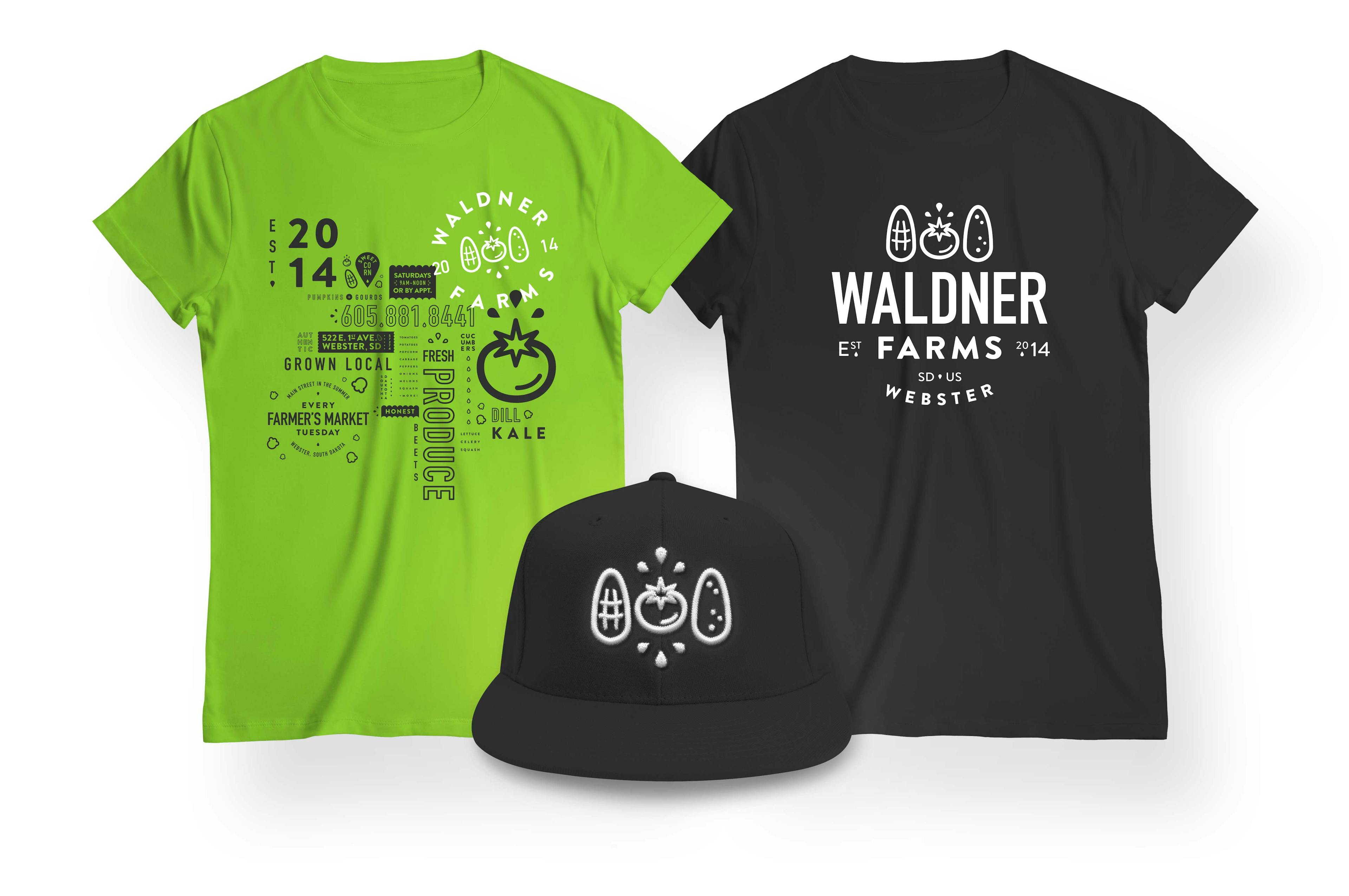

Wearing Local with Pride
Waldner Farms is both family and community focused. To reflect this notion, we designed shirts with a local print vendor to sell and giveaway at the Farmer's Market and other local events.
Today, Waldner Farms continues to grow with fresh new ideas and events, and we are looking forward to what they come up with next.

"We really like working with Kristi at Wire Design Company! It all started with a need for a new logo for our fresh produce farm in Webster, SD. We loved what she came up with and she has since helped with signage, packaging, shirts and more. Highly recommended!"
See Next Project